Generated by Contentify AI

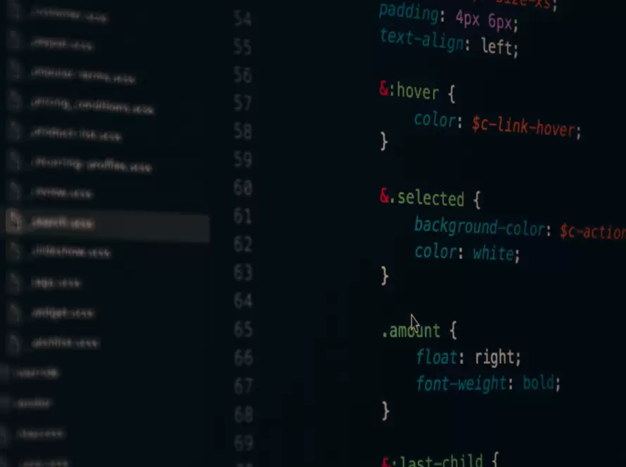
Creating responsive buttons with CSS is a crucial skill for any web developer or designer. Buttons are an integral part of user interfaces, and having buttons that adapt to different screen sizes and devices is essential for a seamless user experience. In this blog post, we will explore some techniques and best practices for building responsive buttons using CSS.
One of the first things to consider when creating responsive buttons is their size. By using percentage-based dimensions instead of fixed pixel values, buttons can automatically adjust to the available space. This ensures that buttons look great on all devices, from large desktop screens to small mobile screens.
Another important aspect of responsive buttons is their positioning. CSS flexbox provides a flexible and powerful way to create responsive layouts, including button placement. By using flexbox properties like justify-content and align-items, buttons can be easily centered or aligned in any desired position.
Ensuring that buttons are visually appealing and easy to interact with is also crucial. CSS can be used to style buttons with different colors, gradients, shadows, and hover effects. It is important to strike a balance between aesthetic appeal and usability, ensuring that buttons stand out and are easily clickable.
Finally, testing and refining the responsive design of buttons is essential. Using browser developer tools and responsive design checkers, the appearance of buttons across different devices and screen sizes can be thoroughly evaluated and optimized. It is important to consider factors such as font size, button spacing, and touch-friendly dimensions when testing responsiveness.
In conclusion, creating responsive buttons with CSS is a skill that every web developer and designer should possess. By considering factors such as size, positioning, styling, and testing, buttons can be made to adapt and look great on any device or screen size. With the techniques and best practices outlined in this blog post, implementing responsive buttons in your projects will be a breeze.
Key Takeaways
- CSS can be used to create responsive buttons
- Media queries can be used to adjust button styles based on device size
- CSS transitions and hover effects can be used to enhance button interactivity